 I did a post October 1, 2014, where I was chasing a sunset. In it I mentioned that I had missed making a good shot a few days earlier because the light went away before I could I could change my exposure.
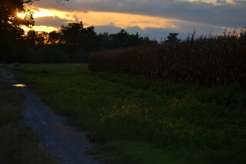
I have to get a bunch of prints edited tonight and off to Kid Matt for an exhibit in Altenburg on October 23, so I was looking for something that wouldn’t require much research. In sifting though what I had talen recently, I ran across the bad sunset photo. It was about three stops underexposed, but I could see the golden tassels that attracted my attention. Click on the photo to make it larger.
Can I bring it to life?
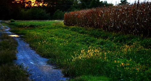
The first thing I did was crop out a lot of the sky because it was blown out. I went so far as to crop out ALL the sky and planned to let the golden reflection in the water puddle carry the theme. Doing that made the composition awkward because the cornfield didn’t look “right,” so I loosened it back up. It still might be a tad tight.
The next step was to boost the highlights to emphasize the backlit weeds. Next, I brought down the shadows. That made the contrast greater. I opened up the midtones a little so you could see the details in the green grass. The cornfield had gone an ugly dark color, so I “dodged” the shadow areas and the highlights to bring out the “cornness.” [The spellchecker doesn’t like that word. If it doesn’t exist, it SHOULD.]
So, I was able to dig into a digital darkroom bag of tricks to save a photo I was ready to discard. Interestingly enough, the first frame of a total of 10 exposures taken in less than 60s seconds was the best. What I like is that even though the picture was “saved” in the darkroom, it is faithful to the way my eye saw it when it was taken.
It ain’t great art, but it’ll do so I can get on with my other work for the night.
Here’s the original
 You can see why I thought it was a goner when I first saw it.

Ken, I love this photo. It’s evocative of a path that may lead somewhere…and maybe not. Lots of thoughts in that picture….
Bill, Sounds like it needs to be the cover of one of your books.
I’d take that path – it looks “the less traveled one.”