 Five Generations of Steinhoffs have eaten at Wib’s BBQ Drive-In
 Jackson’s Wib’s BBQ Drive-in was born in 1947, the same year I was. I don’t think my parents took me straight from St. Francis Hospital in Cape to Wib’s, but my grandson, Malcolm, was still in diapers when he made his first pilgrimage to the Mecca of Meat.
When we were in Cape last fall, I managed to make four visits to the place, much to my mother’s chagrin. On the last visit, I ordered six Brown Hots to Fed-Ex back home to Son Matt, D-in-Law Sarah and Kid Malcolm.
Some folks have tried to pack them in dry ice, we’ve found that’s not necessary.
We pick up half a dozen Brown Hots, unwrap them until they cool down (to keep them from getting soggy), put each sandwich in an individual Ziploc bag, then Fed-Ex them overnight to. Heat ’em up and they’re good to go. Haven’t had anybody die on us yet….
We’re pretty sure that at least five generations of my family have eaten at Wib’s.
I spent more time at Wib’s than Wimpy’s

While most of my classmates were hanging out at Wimpy’s and Pfisters, I practically lived at Wib’s when I was working for The Jackson Pioneer in the mid-60s.
The sandwiches were cheap, the waitresses were cute and they made the best shakes in town. (Unfortunately, they quit making shakes several years ago and the wonderful homemade pies are history, too.)
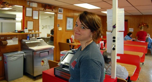
The waitresses are still cute

Best of all, it was located just down the road from the newspaper and courthouse and almost right next to a small park with a municipal swimming pool that was a great source of wild art.
(Nah, Jackson wasn’t THAT wild. Wild art is newspaperspeak for pictures that can run without a story. Think cute kids and animals.)
What’s special about the BBQ?
 I don’t know. My mother claims that no pigs are hurt in the making of the sandwiches, and I have to concede that they are a little light on meat.
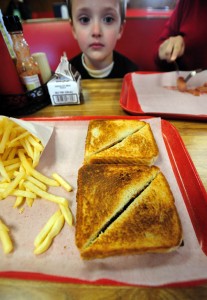
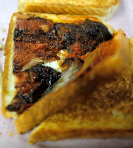
On the other hand, what’s there is nicely smoked and touched off with a peppery sauce that doesn’t overwhelm the taste of the meat. If you order a Brown Hot (the brown, outside, smokier part of the shoulder) with hot sauce, you’d better have a drink handy.
Meat is hickory-smoked
A short history of Wib’s is printed on the back of the menu. It was founded by Wib Lohman, who had a trucking company. He started out selling barbecue sandwiches to his drivers.
 The original smoker used hickory and nothing has changed.
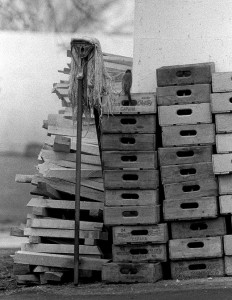
I took this picture of a robin stealing string out of a mop propped up against a stack of Pepsi crates next to some of the hickory used for smoking the meat on April 13, 1967. The next day, The Missourian ran the photo (or one similar to it) with a long, nonsensical story that was uncharacterstic of the paper. (Follow the link at your own risk.)
The piece didn’t have a credit line, but I assure you that I did not write it.
I can only assume that
- Editor John Blue was out of town.
- It was an extremely slow news day.
Note that the Pepsi crates have “Capaha” printed on them. I wonder if that means that they were bottled in Cape or the surrounding area. I know Cape had a Coke bottling plant on Broadway, but I’m not sure about Pepsi.
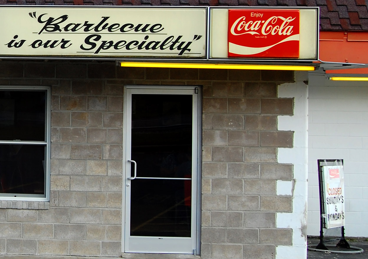
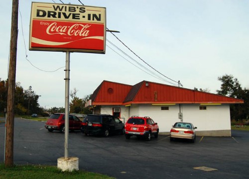
The outside doesn’t look like much

It’s just a concrete block building painted white. There’s plenty of parking and a walk-up area on one side. The front door was always notoriously hard to open, but that was solved when a local teenager ran into the front of the building June 17, 2008, doing about $25,000 in damage.
He fessed up to his parents and restitution was made. The front windows were changed to deeper ones and the balky front door was replaced.
One wag remarked, “That poor kid will have to leave town. He’s going to be known as the boy who drove into Wib’s for the rest of his life.”
Wib sold Wib’s to the Hoffmeisters in 1948
 Wib Lohman got tired of running a seven-day-a-week, 6 a.m. to 1 a.m. business and sold it to Jack and Sweetie Hoffmeister, who ran it until 1972, when it passed on to A.D. Hoffman.
The Hoffmans own it now
It stayed in the Hoffman family when A.D.’s son and his wife took it over in 1986.
Wib’s opens at 8:30 a.m. (mostly for coffee drinkers; they usually sell less than 10 sandwiches before 11 a.m.) and stays open until 6:45 p.m. Tuesday through Friday. Saturday they’re open 9 – 6:45. They’re closed Sundays and Mondays.
Prime time is the lunch rush when about 300 sandwiches are served.
Wib’s has a Facebook Fan Page
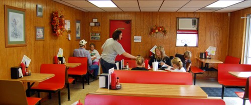
 In the Old Days, the place had four car hops to handle drive-up orders. These days, if you don’t want to eat inside, you can go inside to a walk-up window to place your to-go order.
Every kid in Jackson must have worked there at one time or another. Many started in high school and continued through college. At least one couple met while working at Wib’s and the proposal took place in the parking lot.
Wib’s even has a Facebook Fan area with over 800 members.
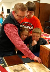 After the formal ceremonies, many of the attendees stayed around for refreshments and to look at old school scrapbooks and yearbooks.