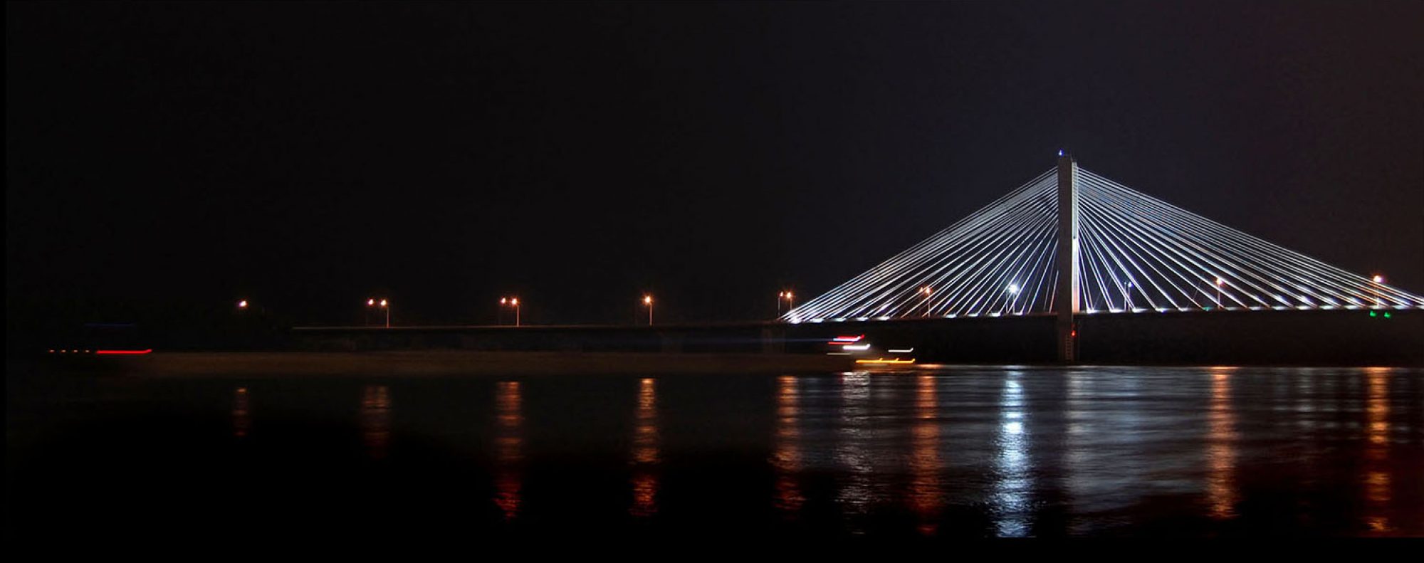
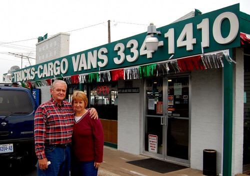
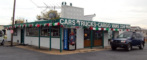
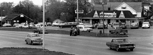
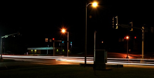
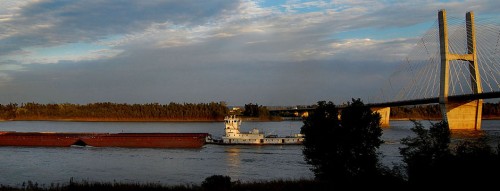
 I have a friend who was looking for some stock photos of Cape to use as headers on a web page. I started poking around and came up with these old and new photos that I think capture some of the spirit of the town.
The biggest challenge was finding pictures that would fit the exact format shape – a skinny horizontal.
Photographers HATE to shoot for shape
 Photographers HATE going out to shoot for shape. We always figured that was a sign that the page designer was too lazy to work with the most story-telling photos on deadline. He wanted to dummy the page early so he could go home early.
Photographers, of course, believe that every photograph is perfectly composed. Some would express that conceit by printing their photos “full frame” with black borders that indicated that the picture had not been cropped. (Guilty as charged.)
Of course, as a guy who had to do his own layouts, I found that sometimes cropping the photo made the page look a lot better. It was OK if I did it; it was a mortal sin if someone else did it.
Photo gallery
Since I’m not exactly sure what my friend is looking for, I’ve pulled together photos that you’ve seen before and some that were in the pipeline. I’m curious to see what you think best says “Cape Girardeau.”
If she uses any, I’ll post the website address. As always, click on any photo to make it larger, then click on the left or right side to move through the gallery.
